Last month we launched ftrack Studio 4.3, which included the most significant update to ftrack’s scheduling and resource management tools yet. Below, we dive into the details of ftrack Studio 4.3’s new and improved planning capability. Find out how you can use these tools to improve productivity and optimize workflow at your studio.
Add clarity: group projects and users
It’s now much easier to see who’s working on what using ftrack Studio 4.3’s planning tools.
Typically, scheduling in ftrack Studio visualizes the full plan of a studio’s projects, with tasks, events, and milestones visible – or the same thing but for users. This view provides a comprehensive overview of ongoing activity. However, if a studio has a large amount of work planned, the screen can fill up pretty fast.
In ftrack Studio 4.3, you can group the projects and users views of the timeline, thus opening up space and providing better visibility over project activity. There are several options to choose from: you can choose to view your events and tasks by project, by type, or grouped under their parent (e.g., shot).
Here’s how to group projects and users in ftrack Studio 4.3:
- Navigate to the Projects or Users timeline view
- Open the ‘Settings’ panel
- Use the ‘Group by’ dropdown to change how the timeline is visually grouped
Heighten visibility – assign a color to events and tasks
Make what’s what in your schedule discernible at a glance! When you have a lot of data, the easier it is to break it down, the easier it is for you to work with it. That’s why we’ve added the ability to color-code events and tasks. Even with a quick look, you can establish where you’re spending resources on a project.
This approach all makes for a more colorful – and more instantly readable – project plan.
Here’s how to color events and tasks in ftrack Studio 4.3:
- Navigate to the Projects or Users timeline view
- Open the ‘Settings’ panel
- Change the color of tasks or events using the ‘Appearance’ section of the menu. You can color tasks by Project, Type, Status or Priority. Events can be colored by Project or Type.
Make your timeline more compact: hide inactive users
You can clear up your timeline by hiding projects or users with nothing scheduled. It makes for a less cluttered plan and helps to focus your attention solely on those who are active on a project.
Here’s how to hide unscheduled users in ftrack Studio 4.3:
- Navigate to the Projects or Users timeline view
- Open the ‘Settings’ panel
- Select ‘Hide empty rows’. Voila! Users or projects without scheduled items will be hidden from the timeline
Receive more information of effort + improved tooltips
Events that do not have 100% effort applied now clearly state so on the event bar. This extra information provides insight into how much work a user expects to complete on a task over a given time.
If more attention is required, you can quickly ascertain which tasks have priority, which don’t, and which need more focus.
We’ve also made ftrack Studio’s tooltips much more informative. Again, this provides a better picture of ongoing work at your studio – not to mention more information with which to optimize workflow – and all with less effort required upfront.
Work faster: a complete performance overhaul
Last but not least, we’ve updated the technology that powers ftrack Studio’s planning functionality. That means better performance and increased speed when scheduling in ftrack Studio 4.3 – not to mention more potential to improve these tools with even more features in the future.
Watch this space…
Maximize productivity with flawless planning
Find out how ftrack Studio 4.3 can optimize resources and take your creative capability to the next level.
More from the blog
Enhanced performance in ftrack Studio: Fine-tuning for speed, reliability, and security
Chris McMahon | API, Developer, New features, Product, Productivity, Studio | No Comments
Backlight and the Visual Effects Society forge a partnership for the VES Awards judging process
Kelly Messori | Case Study | No Comments
Presenting the new sidebar: Enhancing project navigation in ftrack Studio
Chris McMahon | New features, Product, Release, Studio | No Comments
Achieving Better Feedback Cycles and Faster Nuke Workflows at D-Facto Motion Studio
Kelly Messori | Case Study, Studio | No Comments
Making the switch: The transition to cineSync 5
Mahey | Announcements, cineSync, News, Product | No Comments
Supporting Your Studio: Free ftrack Studio Training and Office Hours from Backlight
Kelly Messori | News | No Comments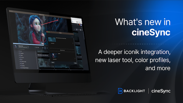
What’s new in cineSync – a deeper iconik integration, laser tool, OTIOZ support, and more
Chris McMahon | cineSync, New features, Product, Release | No Comments


