ftrack Studio is changing! We’d like to introduce our long-term effort to improve user experience, functionality, and accessibility across the ftrack platform. The first step in this implementation is the new and improved ftrack Studio sidebar, which is now available to all Studio and Enterprise users.
ftrack Studio launched in 2012 to address the needs of creative professionals worldwide. Our goal was always to push user-friendliness and reduce friction in post-production workflows, even when the projects on which ftrack Studio was used were anything but simple. Over the last ten years, ftrack Studio’s design has refined and evolved with this in mind, but there’s always been room for improvement, especially as users’ expectations of what a modern UI looks like have evolved.
So, today, we can reveal the commencement of a grand redesign of the ftrack Studio interface – and the technology stack underpinning it.
Over recent months, ftrack’s engineering team has established a solid foundation of components and a new front-end development stack for ftrack Studio (which is already used in ftrack Review). Using this new infrastructure, all aspects of the ftrack Studio platform and user experience can be improved in a significant UI evolution of the ftrack platform.
This effort will not happen all in one go. ftrack Studio will be updated piece by piece, ensuring each design evolution works flawlessly before moving on to the next.
ftrack Studio’s new sidebar
Over recent months, we analyzed and summarized numerous customer interviews to understand what our users would like to see from the next generation of ftrack Studio. In doing so, we noticed a preponderance of comments related to ftrack Studio’s sidebar and UX.
The sidebar is one of ftrack Studio’s most-visited and utilized tools; it’s where users go every day to find details about their tasks, read and address feedback, launch DCC applications, and more. As such, we focused on the sidebar to improve its navigational capabilities, UI, and overall flexibility. Here’s what we’ve improved:
Better design and navigation
We’ve focused the sidebar’s design process on flexibility. The sidebar’s top section presents the most critical information. The chip presentation is designed to scale and convey clear information for both small and large datasets.Docked mode
In the past, ftrack Studio’s sidebar could hide information when appearing on top of another view. To address this, the new sidebar introduces a new “docked mode” that allows the sidebar to appear alongside the currently viewed screen instead of overlaying it. You can also view the side panel modally. (I.e., the sidebar will prevent interaction with any other UI until dismissed.) This modal view will be handy if you’re accessing ftrack Studio on a small screen or tablet.Permissions and user roles
The new side panel fully respects permissions and user roles, so users will only see information in the side panel if they have the appropriate access rights to view it.Configurability
The sidebar will feature a high degree of configurability. You will be able to configure what information you would like displayed in the sidebar based on workflow, object type, and user roles.See the new sidebar in action
ftrack Studio’s sidebar is now available for all Studio and Enterprise users. Try the new sidebar today.
Building the next generation of ftrack
ftrack Studio’s sidebar is an often-used tool that can be improved to benefit our users, but it is also a great starting point to embark on our journey toward a bigger, better ftrack Studio UX. So, the new sidebar is more than a feature – it is the beginning of an evolution for the ftrack platform.
In working on the sidebar’s implementation, we established the foundational components and development stack that will go on to improve every part of the ftrack Studio platform in the coming months. As a result, we have been able to shift our development efforts onto the new front-end stack and start replacing older or less efficient parts of ftrack Studio without needing to rewrite the whole application from scratch – kind of like restoring a classic car with new, shinier, and better functioning parts. This effort also means our development team will become more familiar with the codebase and can start building out even more excellent ftrack Studio features using a new library of UI components.
At ftrack, we remain 100% focused on our users, and we’re dedicated to the continual evolution of our platform, whether that means delivering new features, making life easier for our users, or improving user experience across the board. We’re now better equipped than ever to innovate, iterate, and reduce the friction often experienced in post-production workflows. The sidebar is just the start of an even better ftrack Studio.
Try ftrack Studio today
Experience production tracking in ftrack Studio for free. Start your free trial below.

More from the blog
Enhanced performance in ftrack Studio: Fine-tuning for speed, reliability, and security
Chris McMahon | API, Developer, New features, Product, Productivity, Studio | No Comments
Backlight and the Visual Effects Society forge a partnership for the VES Awards judging process
Kelly Messori | Case Study | No Comments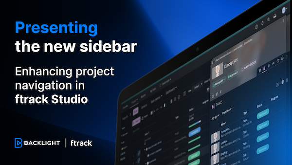
Presenting the new sidebar: Enhancing project navigation in ftrack Studio
Chris McMahon | New features, Product, Release, Studio | No Comments
Achieving Better Feedback Cycles and Faster Nuke Workflows at D-Facto Motion Studio
Kelly Messori | Case Study, Studio | No Comments
Making the switch: The transition to cineSync 5
Mahey | Announcements, cineSync, News, Product | No Comments
Supporting Your Studio: Free ftrack Studio Training and Office Hours from Backlight
Kelly Messori | News | No Comments
What’s new in cineSync – a deeper iconik integration, laser tool, OTIOZ support, and more
Chris McMahon | cineSync, New features, Product, Release | No Comments


